

THINK BOARD
Prioritizing the home entry — Not the garage!
It’s astonishing how many homes across modern day suburbia have their garage out front and center! Unfortunately, when this occurs, the homeowner is unwittingly downplaying the home’s personality, character and importance of the home’s entry.
It’s not uncommon, that many homes across north America are packed in like sardines. This also represents an outdated zoning code. However, this lackadaisical and not very creative approach is undermining the sense of place and individuality. As ‘modern’ society has grown, it has led to an infatuation with machines and technology. Has this infatuation come with consequences? In fact, it has! It created a culture of cheap, mass produced products that advanced a skin deep beauty. We have lost the art of building, not to mention design. Technology can be wonderful, however, it needs to be directed to serve human beings.
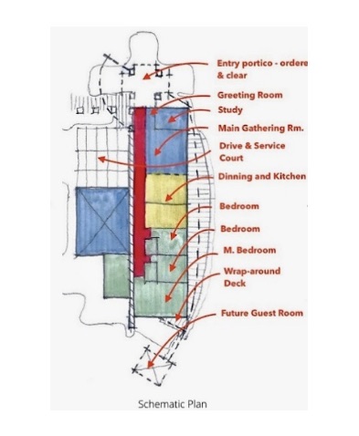
The sketches at left reflect a preliminary design concept to establish an ordering process. That phase seeks to align the various functions in a meaningful way. The schematic design establishes a language of how the home functions and works with the rest of the project, Its establishing a relationship between program and design. In addition, the simplicity and ease of function dramatically improves when the mundane service areas. like the garage, are properly positioned. The entry by nature, is a more important and noble in function.
Design work offers immense benefits; not only upon the aesthetics, but the natural order and functions which all need to work together. In addition, well thought out design, harmonizes form, function and aesthetics to provide meaningful solutions that interface with human beings, not machines.

Modify existing Townhome (Gobstopper):
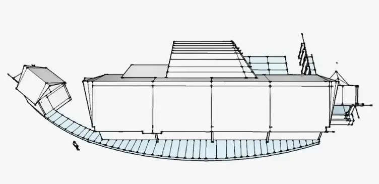
The townhome project began with a design challenge by owner to improve a builder’s proposed cookie cutter scheme (too terrible to show). The above noted picture represents our study model that we produced to delineate a few revisions, The model also helped to create a quick way to interpret the improvements and its overall effect. We started by simplifying the roof and entryway. We also proposed angling the garage to allow some individualization of town home.
In our limited scope, we focused on the following three areas: 1. View of golf course, creating expanded views at rear, 2. simplify roof plan, and 3. Improve functionality. In addition, each area of the scope needed to harmonize the entire town home. No project should be a fragmented array of pieces, but must work together.
The updated design revisions entailed changing the rear of the town-home to allow for a dual view of the golf course. In addition, the roof system was greatly simplified and the entry was redesigned to allow more natural light.
The scaled massing model, that was crafted, to convey our ideas that could be quickly interpreted and serve as a design tool. In addition, due to existing design issues, it was important to be able to develop a new concept quickly.
The story of this design challenge represents the power of design and the effect it will have for years to come. Design work is not arbitrary, it creates meaningful solutions and value for years to come.
Information Kiosk @ Normandale Community College
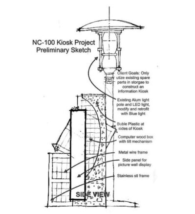
The sketch at left depicts a design for a new information Kiosk at Normandale Community College. The design program entailed a program for a new information kiosk. The purpose was to serve a ‘way-finding station’. The information Kiosk would be built only with ‘spare parts’ that existed on the campus. In addition, the project was driven by a mandate to be 90% sustainable. (with exception of proposed computer system and new fasteners)
The Kiosk contains a computer terminal and keyboard which allows a visitor or student to have access to the campus network and information system. The sketch at left shows the side view and depicts the materials that were chosen. This included wood from pallets, and an existing parking lot light and pole, which was transformed as a beacon for the Kiosk, and “Coachella” for school festivities.
How to Design Almost Anything:
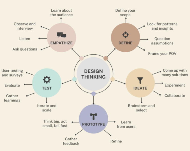
At Arc Castle Studio, we serve as envisioner’s.,and believe that our design process that can be implemented to design almost anything. Our approach goes beyond the traditional architect’s approach. We place more emphasis on the front-end were the real work occurs, We believe this is the most important aspect of setting the project on the right track, setting the clients goals, etc,. The ‘front-end’ is about seeking to understand how it works, uncovering challenges, asking questions, and envisioning solutions through preliminary design thinking.
Utilizing a design mindset: we serve as envisioner’s
1. Project Understanding: seeking to uncover, establish goals, developing program, This is also about developing the why, and understanding whats most important.
2. Research, and diagrammatic: envisioning, and establishing the due diligence associated with technical requirements, code and applicable site..
3. Schematic Design Package: putting the project together, establishing order through a deliberate plan; diagrammatic sketches, massing model studies, overall using the power of a design mindset to problem solve an bring great value and solutions to the client.
The most important part of any project is the front-end. This defines the scope, establishes clear goals and creates order., and mitigates risk. This also forms and shapes the project from its early beginning with an authenticity that can only be accomplished with this approach.